

A brand's image doesn't come down to its logo. It comes down to how it feels to use its digital products. A confusing user experience or an inconsistent interface can undo, in seconds, trust that took years to build. That's why at Tuix we combine software development with a strong UX and graphic design team, able to give your brand a coherent visual identity across every digital product.
Here's how we built this approach at Tuix, and why it can make a difference for your own company.
What is a design system, exactly?
Put simply, a design system is a set of rules, visual elements, and reusable components that make sure your brand looks and feels the same everywhere your customers find you: your app, your website, your emails, your internal dashboards.
It's not just about "looking nice." It's about consistency, speed when launching new features or products, and a user experience that builds trust. Without one, every team ends up inventing its own buttons, colors, and styles, which over time means more development time, higher costs, and a fragmented brand image.
A solid design system rests on four pillars:
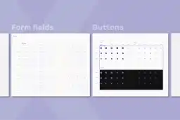
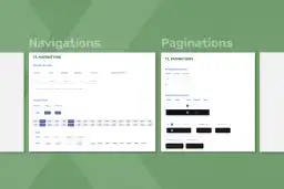
Reusable components: buttons, form fields, menus, cards: pieces designed once and used everywhere.
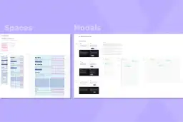
Style guide: the typography, color, spacing, and icon rules that keep everything unified.
Grid system: how each screen is visually structured to look clean and functional.
Documentation and a central library: a single source of truth where design and development work from the same version, avoiding duplicated effort.
The business outcome is tangible: faster launches, less rework between design and development teams, and a brand that comes across as solid and trustworthy to your customers and investors.
Our process: building a design system from scratch
1. Understanding brand identity before designing anything
It all starts with a question that sounds simple but few companies can answer clearly: what does your brand stand for? Before picking a single color or typeface, at Tuix we sit down to understand the company's values, mission, and personality. That foundation guides every visual decision that follows.

2. Listening to users
No successful design is built on assumptions. We study how people actually use the product: what frustrates them, what they expect, what makes them trust an interface. This step keeps time and money from going into solutions that look good but don't work well.
3. Modular design: building in pieces, not from scratch every time
This is where efficiency happens. Instead of designing every screen from zero, we use an approach called atomic design: the smallest pieces come first (a button, a text field), then combine into larger blocks (a form, a menu), which finally assemble into full screens and products.

The advantage for a business is direct: when you need a new feature or screen, you're not starting from zero. It's assembled from pieces that are already tested and approved, cutting development time and costs, and avoiding visual inconsistencies.
4. Color and typography: your brand's visual voice
Choosing the right color palette and typography isn't just an aesthetic choice: it's a business decision. Colors and fonts communicate trust, warmth, seriousness, or innovation, depending on how they're used.

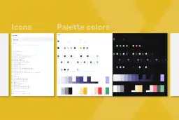
For our own system, we built two palette versions: a light one, bright and aligned with the colors of the Tuix logo, meant to convey clarity and simplicity; and a dark one, with deep tones and strong contrast, ideal for modern interfaces and comfortable reading in low light. Both complement each other and can be used depending on the product's context.

Typography, in turn, needs to be more than legible: it should reflect the brand's personality and work well on any device, from a phone to a desktop screen.
5. A central library where everything lives in one place
All these elements, colors, typography, components, are organized into a central design library. This makes sure that no matter who on the team is working on a project, everyone uses the exact same pieces.


Here's an important distinction for any director or manager weighing this investment: a simple style guide is just a visual reference document. A true design system is directly connected to development: when a designer updates how a button looks, that change also carries over into the code developers use. Design and engineering move together, with no friction and no outdated versions.
6. A living system that keeps improving
A design system is never "finished." It's fed continuously by user feedback and usage data, allowing the experience to keep improving as the company and its products grow. On top of that, every design system is unique: it's shaped by each brand's specific needs and by the different settings where it appears, whether a mobile app, a website, or an internal dashboard. There's no single, final formula, just a living process that adapts and evolves alongside the company.
Why this matters to your company
If you're running a company, you probably don't need to know how a button is coded or how a component library is structured. What matters is what it means for business results:
Brand consistency at every customer touchpoint, no matter how many teams or vendors are involved.
Faster launches of new features, campaigns, or digital products, since nothing starts from zero.
Lower costs in design and development over the medium and long term.
A professional, trustworthy image for your customers, partners, and investors.
Design and development, on one team
At Tuix we combine software development with a graphic design and UX team that treats technology and aesthetics as part of the same product, not separate concerns. We build custom design systems that reflect your brand's unique identity and ensure a consistent, memorable experience across all your digital products.
If your company is ready to take the next step toward a stronger, more professional digital presence, let's talk. We can help you build the design system your brand needs, from the ground up.

Reusable components (buttons, fields, cards, menus), a style guide with color and typography rules, a grid system for structuring each screen, and a central library where design and development work from the same version of every element.
A style guide is just a visual reference document. A design system is directly connected to development: when a designer updates a component, that change also carries over into the code developers use.
Yes. The process always starts by understanding the company's existing values, mission, and personality; the system is built to reinforce that identity, not replace it.
It applies to any digital product: apps, websites, emails, or internal dashboards. Each system is shaped by the specific settings where the brand shows up.
The system isn't static. It's fed by user feedback and usage data, and evolves alongside the company and its products.