


As a company grows, it usually ends up with several digital products built at different times, by different teams, sometimes using different technologies. It's a normal part of growing. But it also creates a common problem: buttons that don't quite match, colors that vary slightly, and a brand that starts to feel inconsistent from one product to the next.
At Tuix, we saw this coming before it became a problem for us. Since we knew several of our own products would be built at the same time, we decided to solve it from the start: we built one shared set of visual pieces that every product could use, no matter how it was built underneath.

What Tuix Web Components Is
Tuix Web Components is a ready-made set of visual pieces, buttons, forms, cards, menus, and other everyday interface elements, that can be reused across any digital product. Think of it as a shared box of building blocks: once a piece is designed and tested, it can be placed into any website or application, regardless of the specific technology used to build it.
That's possible because these pieces are built using a technology that every web browser already understands natively. In practice, this means the same button, the same menu, or the same form will look and behave exactly the same way, whether it's used in one product or another, without anyone having to rebuild it from scratch each time.

Built Like a Set of Building Blocks
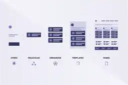
To keep the library easy to grow and maintain, we designed it using a well-known approach in the software industry called Atomic Design: you start with the smallest pieces, like a single button or icon, and combine them into bigger, more complete pieces, like a full form or a navigation bar. Relying on a proven method like this, instead of improvising, is part of how we make sure the result is solid and easy to maintain over time.
This same approach is also a major advantage for design teams. Just as developers can reuse the same tested pieces instead of coding them again, designers can rely on the same building blocks when creating new applications or digital products, which makes it much faster to design something new while keeping the exact same look and feel across the whole company.

A Consistent Look, on Any Screen
Every visual piece automatically adjusts to light or dark mode, and to any device, computer, tablet, or phone, without any extra work needed. All the colors and styles are controlled from one central place, so keeping everything visually consistent, even across marketing materials outside the digital product itself, becomes much easier.

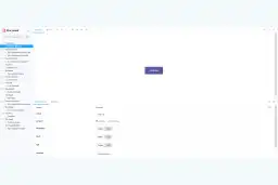
To make it easy for any team to use, even people who didn't build it, the whole library comes with a visual, interactive catalog where every piece can be previewed and tested directly in a web browser, similar to flipping through a visual instruction manual.
Always Up to Date, Without Manual Work
Every time an improvement is made to the library, it goes through an automatic quality check, similar to quality control on an assembly line, before being made available for use. This happens without anyone needing to do it by hand, so every team always has access to the latest, most reliable version, with less risk of mistakes or delays.
From an Internal Tool to a Service for Your Business
What started as a way to solve our own consistency problem is now a service we offer to other companies facing the same challenge: several teams, several technologies, and the need for one visual identity that feels the same everywhere.

No. It's designed to work with whatever technology your products already use, so your teams can keep working the way they already do.
It will look like your brand. Colors, styles, and themes are controlled centrally, so the whole library can be adapted to match your visual identity, including light and dark modes.
In whatever way fits best: as a ready-to-use package for teams using modern development tools, or as a single file that can be added directly to any web page.
Every approved change is automatically checked and made available to every team using the library, so everyone always works with the latest, most reliable version.
Yes. Every visual piece comes with its own visual catalog, where developers can see it, try out its variations, and understand exactly how to use it, without needing anyone to walk them through it.